Seeing the difference between roads and forests
Colour blindness can make reading maps incredibly hard, with red roads passing through green forested areas. But help is on the way.
COLOUR BLINDNESS: Researchers at the Norwegian Colour and Visual Computing Laboratory in Gjøvik are investigating the possibility of making maps with colour profiles specifically designed to an individual’s ability to see colours.
Colour blindness
The way we experience colour is determined by the composition of vision cells in our eyes, called rods and cones. Rods provide information about light levels, while cones are the eyes colour receptors.
The eye has three types of cones, which are sensitive to red, green and blue light respectively. If there is less of one type than others, or one type is less sensitive, you’ll see colours differently than the average person.
There are different types of colour blindness, although difficulty in distinguishing between red and green is most common.
This doesn’t mean that people with colour blindness have trouble seeing only two colours, however. Reduced colour vision affects the whole colour spectrum.
The goal is to make an app that customizes maps in colours that work for your personal vision needs.
Colours used on maps are usually determined by what they tend to symbolize. Red is often used for important information like roads, because it is a distinctive colour that stands out. But not for the colour blind.
Although there are many different kinds of colour blindness, difficulty in distinguishing between red and green is most common. Colour blindness affects between 8-10 per cent of men, and about 0.4 per cent of women.
In other words, a not-insignificant portion of the population has trouble with red being used as an important colour on a map.
Universal or individual
PhD candidate Anne Kristin Kvitle is a researcher at the Norwegian Colour and Visual Computing Laboratory (the Colour Lab at NTNU i Gjøvik). This lab is part of the Faculty of Computer Science and Media Technology in Gjøvik. She is studying two different ways of customizing on-screen maps for those with colour blindness.
One approach is to create universal maps that work for everyone, so that you can read and understand a map whether you’re colour blind or not.
The goal of this method is to make a map only using colours that the majority of people can see clearly. However, Kvitle is interested in going a step farther, trying to find a solution that creates personalized colour profile—an adaptive solution.
The story continues under the map.
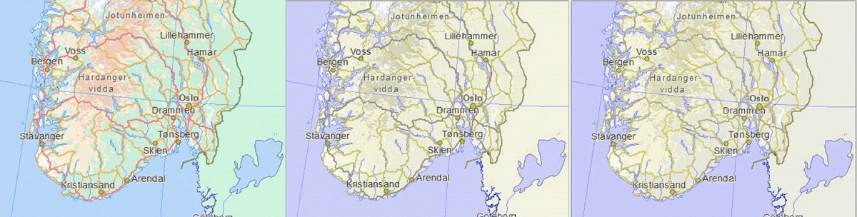
This illustration shows how difficult it can be for those with colour blindness to read maps with conventional colour schemes. The figure shows a map in a normal colour spectrum on the left, and a simulation of two types of red-green colour blindness, protanopia in the middle, and deuteranopia on the right. Map source: the Norwegian Public Roads Administration, visveg.no
Redrawing maps
Other countries, such as Japan and Great Britian, have standardized maps so everyone can read them, but with mixed results.
One of the challenges with making universal map colours is that there is a wide spectrum of colour blindness, so finding a colour palate that works for everyone is practically impossible.
A solution that gives users individually calibrated colour profiles has never been tried before.
“I think that universal map design isn’t necessarily the best solution to the problem, because people with colour blindness see colours very differently. But this adaptive method uses information about what colours a user has difficulty seeing, and re-draws a map to conform to the spectrum of colours they can see,” Kvitle explains.
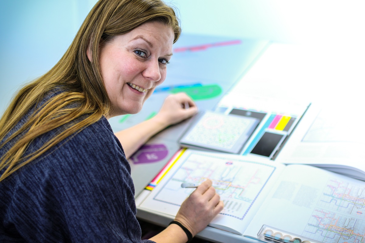
Anne Kristin Kvitle is a researcher at the Norwegian Colour and Visual Computing Laboratory (the Colour Lab at NTNU in Gjøvik). Photo: Anders Gimmestad Gule, NTNU in Gjøvik
Using the adaptive method, custom colour palates will allow users to see different map elements clearly.
The method is based on a colour generation technique that limits the colours displayed to a specific reference spectrum. This way, the contrast between different colours will be enough for anyone to see, but the colours that we associate with different map elements will be preserved as well as they can be.
Designed for an app
Kvitle thinks that custom colour palates will be the future for on-screen maps. The goal is for her research to be applied using an app.
A user of this app will first go through a test to see which colours they struggle to distinguish between, allowing the program to create a custom profile, and find the best palate to use on maps.
To begin with, Kvitle has been using the official on-screen map colour profile from the Norwegian Mapping Authority, testing how standard maps look to people with colour blindness.
Her tests show that people with colour blindness often have a lot of trouble distinguishing colours on maps, and they often struggle to see that a test colour is the same one that is used on a map. The smaller the coloured area, the harder it is to see.
For people with colour blindness, distinguishing between colours becomes more difficult the smaller the coloured elements, and even worse with less light. Maps usually contain a lot of small symbols and thin lines, and we are using more and more mobile devices.
Despite this, web designers and software developers don’t take colour blindness into account in their work, which can cause people with colour blindness to ‘see red’ with irritation when maps and colour palates become difficult to interpret.
- You might also like: Risk-takers are smarter than us normal folks
KMap colours cause confusion
“Colour blindness is a bit of a misnomer. People with colour blindness can see colours, just differently than someone with normal vision,” says Kvitle. “Colour blindness can cause some difficulties in daily life, but most people are able to adjust to the this. For example, you learn that the top traffic light means stop, and then it doesn’t matter if it looks like it could be green. But when it comes to maps and other path finding aids, it is more important to be able to distinguish between colours to be able to correctly interpret it.”
Kvitle’s research provides a better understanding of how our colour vision works, and the individual variation that is found among people with colour blindness. The results of her research project will be an important contribution to making the everyday lives of people with colour blindness easier.
Source: Anne Kristin Kvitle; Phil Green;Peter Nussbaum; Adaptive color rendering of maps for users with color vision deficiencies. Proc. SPIE 9395, Color Imaging XX: Displaying, Processing, Hardcopy, and Applications, 939515 (January 8, 2015); doi:10.1117/12.2083411.