What makes print more readable for the visually impaired?
Type size is the most critical factor in being able to read printed text, but it doesn’t have to be as big as you might think.
Universal design: The number of visually impaired people in Norway is high. The Norwegian Association of the Blind and Partially Sighted estimates that 180,000 Norwegians have been diagnosed with an eye condition. Even more people have poor eyesight due to natural visual deterioration. Researchers at NTNU’s Norwegian research laboratory for universal design (UU lab) have published the biggest readability study of printed text for the visually impaired ever done.
The results provide clear criteria on what print characteristics are essential to enable the visually impaired to also read printed text.
Everyone has the right to participate in society

Study results show that type size matters the most for readability, but the font choice is less important. Photo: Marte Foss / NTNU
The law is in fact abundantly clear: individuals with disabilities should have the opportunity to participate in society on an equal basis with others. This includes access to the written word. Universal design is a necessary prerequisite for this to happen.
“We’ve tested 4.6 per cent of everyone in Norway with visual disorders, and found that font size and contrast affect readability the most for society at large,” says Jonny Nersveen, who heads up the UU Lab at NTNU in Gjøvik.
“The criteria are relevant for everything from public letters to school textbooks, literature, advertising and newspapers,” he says.
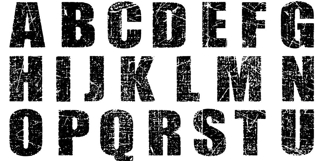
The test group consisted of 830 individuals with an eye disease. In the study, researchers tested how well the visually impaired participants were able to read text in the typefaces Helvetica, Times New Roman, Verdana, Frutiger, Tiresias, Tiresias bold, Scala bold, Scala sense and Scala sans bold.
Legibility was tested in different font sizes, using both normal and bold type. Researchers also checked for font legibility with and without serifs (i.e. the small lines attached to letters in some fonts). In addition, the readers graded the readability of text with different contrast levels between the font and the background.
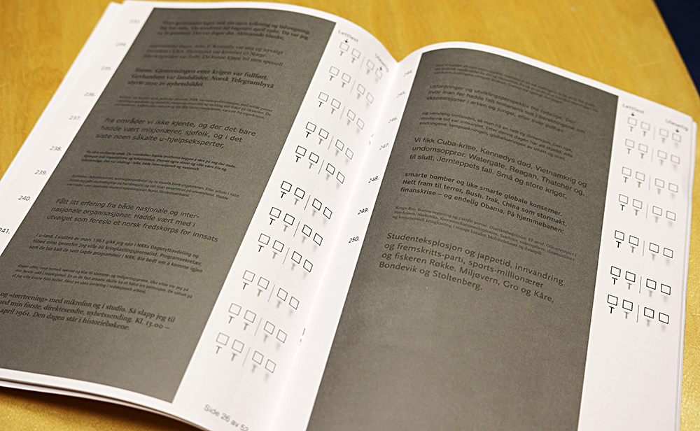
Contrast was shown to matter for readability. Although black letters on a white background worked best for the majority of participants, it turns out we’re not as contrast sensitive as we might have guessed. Photo: Marte Foss / NTNU
Font size most important
The results show that typeface size matters the most for readability, whereas the font choice is less important.
“Somewhat surprisingly, we found that it’s not necessary to increase the size of the font that much to make readability good enough. This is a positive discovery, since economic and space-saving considerations often make it preferable to use a smaller font,” says Nersveen.
“We found that setting the font at 12 point was a well-defined point for readability, which adequately addresses the needs of visually impaired people. If the typeface is smaller than 12 point, readability drops dramatically. Normal contrast allows more than 80 per cent of the visually impaired to read text in 12-point font. It’s a very positive finding,” he says.

Jonny Nersveen, head of the UU Lab at NTNU Gjøvik. Photo: Espen Dalmo
Font size varies from font to font. For the sake of comparison, font sizes are therefore scaled to correspond to the Times New Roman font, which this study used as its font size basis.
Contrast proved to make some difference in readability. Although black letters on a white background worked the very best for most study participants, we are apparently not as contrast sensitive as we might have anticipated. Serifs, which were originally meant to increase readability, sometimes proved to have the opposite effect, but the differences were small. Bold type, on the other hand, increased readability as long as the font size was not too small.
Hoping for spillover effect
Assistant Professor Eivind Arnstein Johansen, now at NTNU’s Norwegian Media Technology Lab, has worked as a designer and typographer and sees a need for this type of study in the industry. He believes the results will primarily be applied by the public sector in guiding the design of printed text, but hopes that the study will also provide an increased understanding for newspapers and other printed media.
“The print industry has had a lot of opinions and assumptions about what works best in terms of typeface, font sizes and contrast,” Johansen says, so “it’s good to now know for sure what will work for most people. If this study results in more publishers increasing the font size, it will be a positive step for both visually impaired and normal-sighted individuals.”
The study was supported by the Norwegian Association of the Blind and the Delta Centre, Norway’s national resource centre for accessibility and social inclusion.